D'out
A mobile application to efficiently plan hangouts using a gamified experience.


ROLE
User Research
Product Strategy
UI Design
UX Design
Usability Testing
TOOLS
Figma
Figjam
UserTesting
Slack
PRODUCT
Responsive mobile app
TEAM
4 members
TIMELINE
10 weeks


OVERVIEW
Choosing things is hard especially when presented with an abundant list of options. We end up spending more time choosing what to do than actually doing it. We intend to design a platform that allows you to easily plan hangouts as a group, avoiding the never-ending choices and inevitable arguments that come with any group planning.

PRODUCT ROADMAP

RESEARCH
Competitor Analysis

SURVEY
Goals
To gain an understanding of how people plan group outings and insights into the positives and pain points that they encounter
Tasks
Our survey had a total of 14 questions that we distributed through the team’s personal network which consisted of International users as well
-
Understanding demographics, relationship status, and frequency
-
Influencing factors (distance, budget, time)
-
Resources
Tested participants on 6 tasks based on research objectives
14
Survey Questions
-
How old are you?
-
What is your relationship status?
-
How often do you plan group outings (movies, sports, dining out, etc.)? (Multiple choice question)
-
How often do you plan dates? (Multiple choice question)
-
Which of the following influence your decision while planning a group outing? (Multiple choice question)
-
Which of the following influence your decision while planning a date? (Multiple choice question)
-
How does budget influence your decision of choosing a particular activity/event? (Likert scale ranging from Definitely would to Definitely would not)
-
What resources do you use to gather information about the activity/event?
-
Do you use an app to gather information about an activity/event? (Multiple choice question)
-
Which app(s) do you use to gather information about the activity/event?
-
How often do you use the above-mentioned app(s)? (Multiple choice question)
-
Is there anything you like about the above-mentioned app(s)? (If yes, please specify)
-
Is there anything you do not like about the above-mentioned app(s)? (If yes, please specify)
-
How satisfied are you with the above-mentioned app(s)? (Likert scale ranging from Very unsatisfied would to Very satisfied)
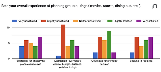
SURVEY INSIGHTS
We received 29 responses, where 87% of our participants were aged 18 - 24 years.
USER FLOWS
Budget

Search & Filter

Favorites

Chat

LOW-FIDELITY WIREFRAMES
We then converted the user flows into low-fidelity wireframes.


MID-FIDELITY WIREFRAMES
After completing the low-fidelity paper prototype, we designed the mid-fidelity screens for each feature in our app using Figma.


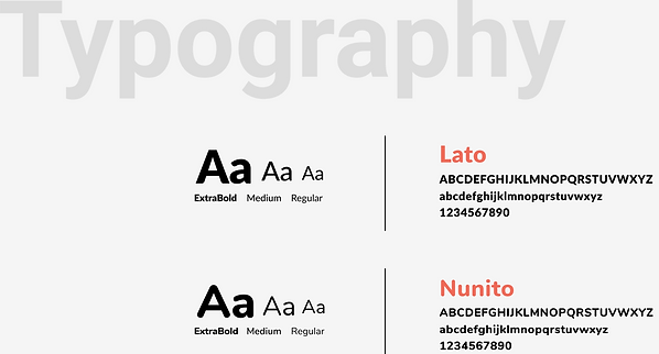
STYLE GUIDE
In order to emphasize the outdoors, vitality, and other characteristics of the application, coral orange is chosen as the primary color.


VISUALS, TESTING, & ITERATIONS

TEST 1.0
Objective
The main objective here was to check if the information architecture and the general layout of the app is understandable by the users.
Effects
Based on the feedback of the participants, the team made a few changes to the layout of certain screens and the information architecture.
EFFECTS OF TEST 1.0


Lo-fi Iterations
TEST 2.0
Objective
The objective here was to see if the visual design and the language used throughout the app aligns with the expectations of the users.
Effects
The team learned that our color palette was not aligned with the vibe of the app and discovered some problems in the share, decide and budget flows. These were solved these taking the feedback into consideration.
EFFECTS OF TEST 2.0

TEST 3.0
Objective
The objective here was to see if the changes made based on the feedback from the previous round of usability testing fixed the issues and improved the overall experience of the product.
Effects
A few participants faced difficulties in discovering the decide feature in the app and expressed that they wouldn’t associate wallet icon to budget. The team came up with a new flow for decide and changed the iconography.
EFFECTS OF TEST 3.0

TEST 4.0
Objective
This round was used to test out alternative flows to evaluate which ones are more intuitive to the users.
Effects
Participants mistook edit budget for adding a new budget and the wallet icon with the small + was not obvious for the users. This was replaced with a universal + for budget that let’s users add a transaction or set a new budget.
EFFECTS OF TEST 4.0


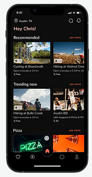
FINAL DESIGN
Keeping the goals, pain points, and the requirements of the user in mind, we have made sure to make the design usable and accessible.


LEARNINGS & WHAT CAN BE DONE
01
For new behaviors that most users are not accustomed to perform, it might be helpful to add a walkthrough or tool tips for certain screens.
03
To help with user retention the team teased out the idea of providing coupons which can be redeemed by the users at the time of booking.
02
Manual work can be automated by integrating popular payment services or by gaining access to the user’s email or messages where they receive their transaction alerts.
04
The recommendations can be futher personalized by asking user’s for information such as food allergies and specific requirements.